
Why this matters more for trades than most businesses
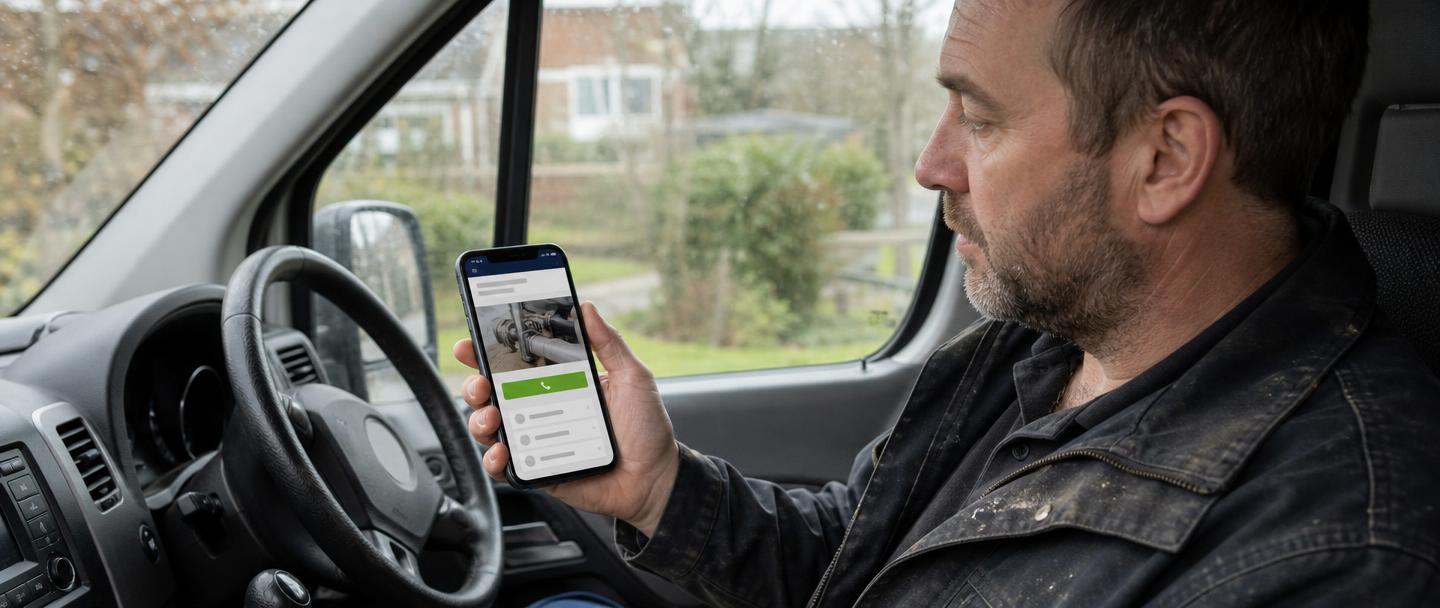
A leak, a dead socket or a tile off the roof is an urgent search, done standing up, usually on a phone. Nobody opens a laptop for it.
That person will try two or three businesses in quick succession. If your page loads slowly, or the number needs pinching and zooming, they simply move to the next result. You never find out it happened.
The fixes that matter most
| Problem | What to do instead |
|---|---|
| Tiny text you have to zoom | Body text at 16px minimum, generous line spacing |
| Phone number inside an image | Real text in a tap-to-call link |
| Huge photos straight off a camera | Compressed, correctly sized, modern format |
| Buttons crowded together | A comfortable tap target with space around it |
| Ten-field enquiry form | Name, number, short description — nothing else |
| Menu hiding the main action | Keep call and quote reachable at all times |
| Pop-up on arrival | Remove it |
Speed is mostly photographs
On the trade sites I look at, oversized images are almost always the cause of a slow phone experience. A photo straight off a modern phone can be five megabytes; the same image properly prepared for the web is often under two hundred kilobytes and looks identical on screen.
Fix the images and everything else usually falls into place. Fonts, tracking scripts and chat widgets add up too, so only keep the ones earning their place.
Test it the way a customer would
- Open your site on your own phone using mobile data, not wi-fi
- Time how long before you can read something useful
- Tap your phone number — it should start a call immediately
- Try the form one-handed and actually submit it
- Check the message arrives, including in spam
- Ask someone outside the business to find your prices in under a minute
The sticky contact bar
A slim bar fixed to the bottom of the screen with a call button and a quote button removes the main reason people give up: having to scroll back to find how to reach you. Keep it to one or two actions, make sure it doesn't cover the content underneath, and don't stack it on top of a chat bubble and a cookie banner.
Accessibility helps everyone
Decent contrast, sensible text size and clear labels aren't only for people with impairments — they're what makes a site readable in bright sunlight on a driveway.
Grey text on a cream background looks refined in a design mock-up and disappears entirely on a phone screen outdoors. Every site I build is checked for contrast and keyboard use as standard.
How I approach it
I design for the phone screen first and let the desktop version follow, because that's the order your customers actually experience it in. Photos are compressed before they go anywhere near the site, contact is always within reach, and I test on a real handset rather than a browser window shrunk down.